---
title: "Travelling to Outer Space"
subtitle: "TidyTuesday Visualisation by Cedric Scherer"
author: "Cedric Scherer (adapted)"
date: "2026-03-24"
format:
html:
theme: [cosmo, ../custom.scss]
toc: true
include-in-header: ../include/fonts.html
execute:
freeze: auto
echo: true
warning: false
message: false
---
::: {.callout-note}
## About this showcase
This is an adaptation of Cedric Scherer's stunning [#30DayChartChallenge](https://github.com/z3tt/30DayChartChallenge_Collection2021) visualisation of astronaut mission data. It demonstrates what R and ggplot2 can produce — publication-quality data art from a single script. This page requires R with several packages to render, so it is pre-rendered locally.
:::
## The data
The dataset comes from [TidyTuesday 2020, Week 29](https://github.com/rfordatascience/tidytuesday/blob/master/data/2020/2020-07-14/readme.md) — a comprehensive record of every human who has travelled to outer space, from Yuri Gagarin in 1961 to the present day.
```{r}
#| label: setup
library(tidyverse)

df_astro <- readr::read_csv(
  'https://raw.githubusercontent.com/rfordatascience/tidytuesday/master/data/2020/2020-07-14/astronauts.csv',
  show_col_types = FALSE
)

cat("Astronauts:", n_distinct(df_astro$name), "\n")
cat("Missions:", nrow(df_astro), "\n")
cat("Years:", min(df_astro$year_of_mission), "to", max(df_astro$year_of_mission), "\n")
```
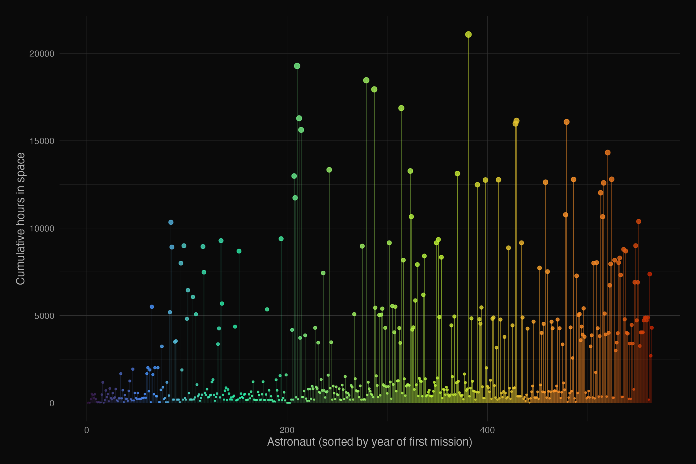
## Cumulative hours in space by astronaut
Each vertical line represents one astronaut, sorted by the year of their first mission. The height shows their cumulative hours in space.
```{r}
#| label: fig-space
#| fig-cap: "Cumulative time in outer space for all astronauts, 1961-2020"
#| fig-width: 12
#| fig-height: 8
#| out-width: "100%"
#| dev: "ragg_png"
#| fig-bg: "#0a0a0a"
df_missions <- df_astro %>%
  group_by(name) %>%
  summarize(
    hours = sum(hours_mission),
    year = min(year_of_mission),
    .groups = "drop"
  ) %>%
  arrange(year) %>%
  mutate(id = row_number())

ggplot(df_missions, aes(x = id, y = hours, colour = year)) +
  geom_segment(aes(xend = id, yend = 0), linewidth = 0.3, alpha = 0.6) +
  geom_point(aes(size = hours), alpha = 0.8) +
  scale_colour_viridis_c(option = "turbo", end = 0.9, guide = "none") +
  scale_size_continuous(range = c(0.2, 3), guide = "none") +
  labs(
    x = "Astronaut (sorted by year of first mission)",
    y = "Cumulative hours in space"
  ) +
  theme_minimal(base_size = 14, base_family = "Source Sans 3") +
  theme(
    plot.background = element_rect(fill = "#0a0a0a", colour = NA),
    panel.background = element_rect(fill = "#0a0a0a", colour = NA),
    panel.grid = element_line(colour = "grey20", linewidth = 0.2),
    axis.text = element_text(colour = "grey60"),
    axis.title = element_text(colour = "grey70"),
    plot.margin = margin(20, 20, 20, 20)
  )
```
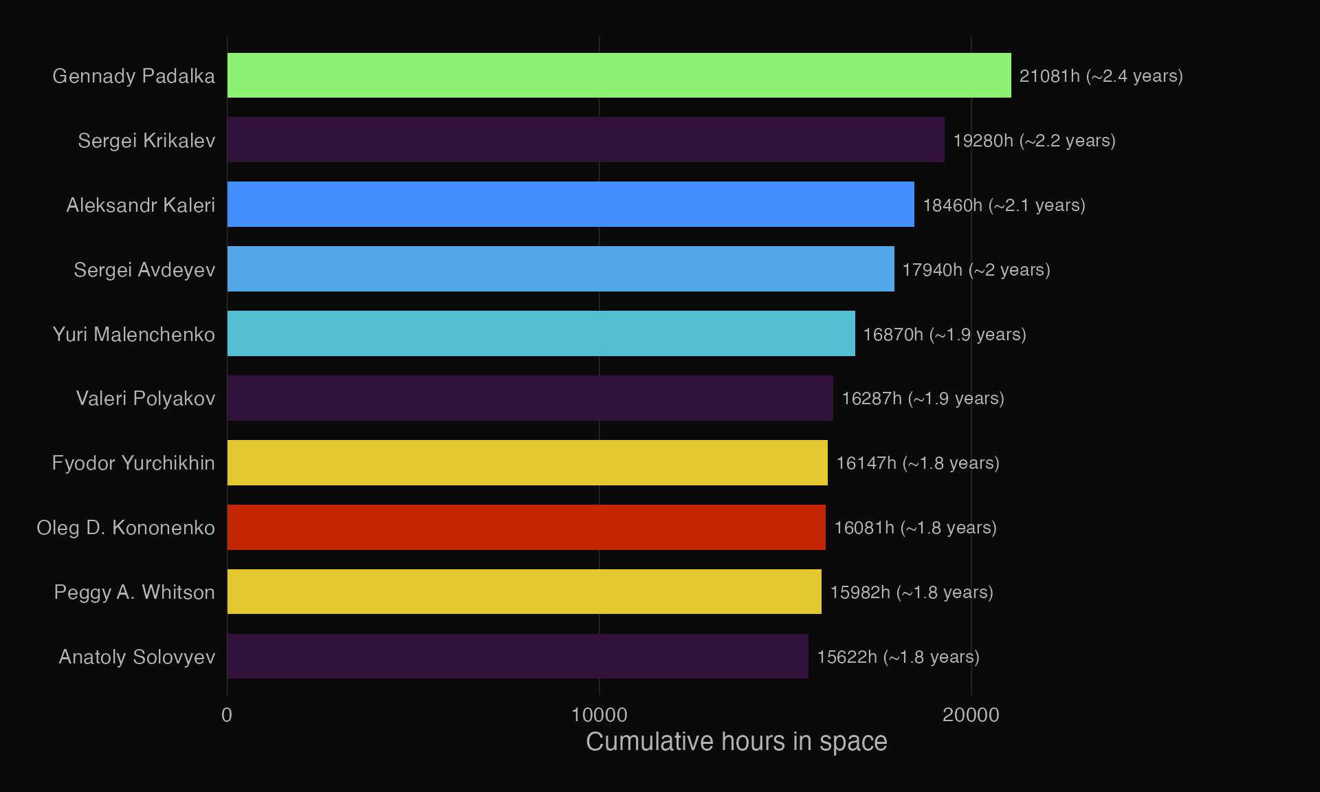
## Top 10 astronauts by hours in space
```{r}
#| label: fig-top10
#| fig-cap: "The 10 astronauts with the most cumulative hours in outer space"
#| fig-width: 10
#| fig-height: 6
#| out-width: "100%"
#| dev: "ragg_png"
#| fig-bg: "#0a0a0a"
top10 <- df_missions %>%
  slice_max(hours, n = 10) %>%
  mutate(
    name_clean = str_replace(name, "(.*), (.*)", "\\2 \\1"),
    years = round(hours / 8760, 1)
  )

ggplot(top10, aes(x = reorder(name_clean, hours), y = hours, fill = year)) +
  geom_col(width = 0.7) +
  geom_text(aes(label = paste0(round(hours), "h (~", years, " years)")),
            hjust = -0.05, colour = "grey70", size = 3.5,
            family = "Source Sans 3") +
  coord_flip(clip = "off") +
  scale_fill_viridis_c(option = "turbo", end = 0.9, guide = "none") +
  scale_y_continuous(expand = expansion(mult = c(0, 0.3))) +
  labs(x = NULL, y = "Cumulative hours in space") +
  theme_minimal(base_size = 14, base_family = "Source Sans 3") +
  theme(
    plot.background = element_rect(fill = "#0a0a0a", colour = NA),
    panel.background = element_rect(fill = "#0a0a0a", colour = NA),
    panel.grid.major.y = element_blank(),
    panel.grid.minor = element_blank(),
    panel.grid.major.x = element_line(colour = "grey20", linewidth = 0.2),
    axis.text = element_text(colour = "grey70"),
    axis.title = element_text(colour = "grey70"),
    plot.margin = margin(20, 40, 20, 20)
  )
```
::: {.callout-tip}
## Original visualisation
Cedric Scherer's original version uses `ggblur` for glowing star effects and custom fonts. This adaptation simplifies for portability while preserving the core data story. See the [original code](https://github.com/z3tt/30DayChartChallenge_Collection2021) for the full treatment.
:::